Любой логотип (эмблема) фирмы, компании, бренда – это не
просто значок или надпись. Логотип, как минимум обязательно должен быть
красивым, оригинальным и запоминающимся. А в идеале он должен еще нести в себе
и скрытый смысл, иносказательность, аллегорию, намек на традиции или ориентированность
компании. Создание логотипа (особенно для известного бренда) это целое
искусство.

Не избежал «зашифрованного послания» и современный логотип
знаменитого южнокорейского бренда Hyundai (Хёндэ).
Компания Hyundai Motor как самостоятельное предприятие была
образована в 1967 году. Первую модель Hyundai помогли сконструировать
специалисты Ford, а вторую — итальянское ателье ItalDesign. Автомобили Hyundai
производились для внутреннего рынка, имели довольно доступный ценник и хорошее
качество. Компания в это время со вторым смыслом для логотипа особо
заморачиваться не стала, и на радиаторных сетках их автомобилей красовалась особо
ничем не примечательная эмблема из латинских букв «HD» что
по неофициальной версии было неким сокращением от HyunDai.
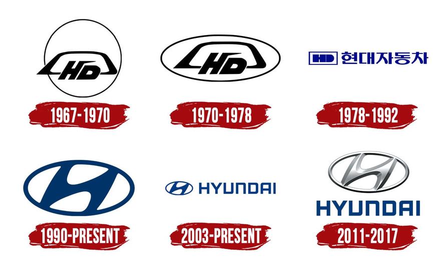
Со временем Hyundai Motor довольно быстро и успешно вышла на
международный рынок, где ее автомобили стали популярными, известными и продаваемыми.
Вот тут и пришло время для смены логотипа с внесением в новый логотип еще и
скрытого смысла.
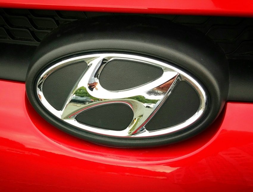
Новым фирменным логотипом Hyundai Motor с начала 90-х годов
прошлого века стала наклонная буква «H» курсивом вписанная в овал. Существует версия, что «H» наклонили для того, чтобы
эмблема отличалась от всем известного значка Honda. Новый логотип получился
очень удачным. Простой, красивый, стильный, да еще и со скрытым смыслом.

О том, какой скрытый смысл был заложен в новом логотипе
Hyundai Motor, можно узнать на сайте компании.
Логотип Hyundai выглядит как первая буква нашего имени, но
он так же символизирует двух человек – компанию и клиента, застывших во
взаимном рукопожатии. В наше время, когда ценность обещаний, заключенных с
помощью рукопожатия, нивелируется, наши обещания клиентам остаются неизменными.
Пожимая руку клиенту, мы даем гарантию на 10 лет или на 100000 миль на каждый
автомобиль.
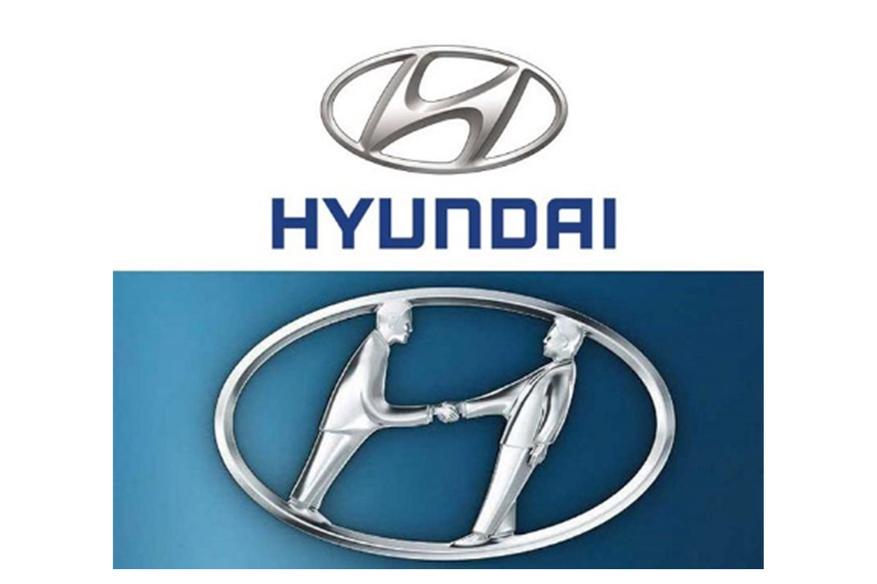
Поэтому новый логотип можно интерпретировать как фигуры двух
людей (представителя компании и клиента) застывших в рукопожатии и находящихся
в довольно необычных позах, наклоненными в правую сторону. В новом логотипе, по
мнению компании, позы людей, застывших в рукопожатии, ярко символизируют
доверительные отношение и партнерство между компанией и покупателем, а овал, в
который вписаны люди, говорит о глобальных намерениях компании.
Восток – дело тонкое.